A broken line graph is one of the most common data display tools in mathematics and one of the more frequently tested graph types in AMC math competitions. At its simplest, a broken line graph shows how a quantity changes over time by connecting data points with straight line segments. The word “broken” refers to the fact that the line changes direction at each data point rather than being one continuous smooth curve. This guide explains exactly what a broken line graph is, how to read one accurately, how it differs from a regular line graph, and how broken line graph problems appear in AMC math contests with worked examples.

What is a broken line graph?
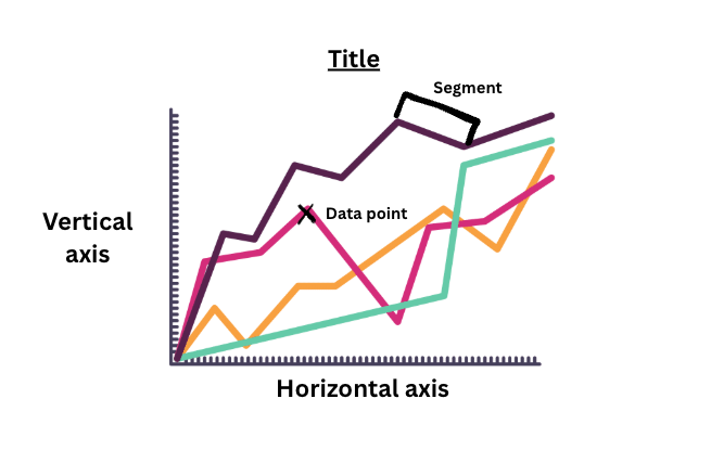
A broken line graph is a type of statistical graph that displays data points connected by straight line segments. Each segment runs from one data point to the next, and because the data values change at each point the line changes direction — creating the broken or jagged appearance that gives the graph its name.
Broken line graphs are used to show change over time. The horizontal axis typically represents time: days, months, years, or any other regular interval. The vertical axis represents the quantity being measured: temperature, sales figures, population, scores, or any other numerical value. Each data point on the graph represents one measurement at one point in time, and the connecting segments show the trend between measurements.
The key word in understanding broken line graphs is trend. The graph does not just tell you the value at each point: it shows you visually whether the quantity is increasing, decreasing, or staying roughly stable across the whole time period, and how quickly it is changing at each interval.
Why is it called a broken line graph?
The name comes from the appearance of the line itself. Unlike a smooth curve, which flows continuously in one direction, a broken line graph changes angle at every data point. Each straight segment between two adjacent points represents the change between those two measurements, and because the rate of change is rarely constant the line breaks — changes direction — at every point.
In some countries and textbooks the same graph is called a line graph, a line chart, or a time series graph. In math competition contexts and many Canadian school curricula, broken line graph is the standard term.
What does a broken line graph look like?
A broken line graph has the following components:
- A horizontal axis labelled with time intervals or categories
- A vertical axis labelled with the quantity being measured and its units
- A series of plotted points, one for each measurement
- Straight line segments connecting each adjacent pair of points in order
- A title describing what the graph shows
- A scale on each axis that is consistent throughout
The line itself will typically go up and down across the graph, with steeper segments indicating faster rates of change and flatter segments indicating slower rates of change.
Broken line graph vs line graph — what is the difference?
This is one of the most common questions students have when first encountering these graphs and the answer depends on context.
In everyday usage, broken line graph and line graph are often used interchangeably to describe the same thing — a graph that plots data points and connects them with straight line segments. In this context there is no meaningful difference between the two terms.
In more technical mathematical contexts, a distinction is sometimes made between a line graph, which can refer to a graph where data is connected by a smooth curve representing a continuous mathematical function, and a broken line graph, which specifically refers to a graph where data points are connected by straight segments with no assumption of continuity between them.
| Feature | Broken line graph | Smooth line graph |
|---|---|---|
| Connection between points | Straight line segments | Smooth curve |
| Data type | Discrete measurements at specific intervals | Continuous function |
| Common use | Real world data over time | Mathematical functions |
| AMC context | Statistics and data problems | Algebra and functions problems |
For the AMC 8 and AMC 10, broken line graphs appear in statistics and data interpretation problems. Students are typically asked to read values from the graph, calculate totals or averages, identify the greatest or smallest change between intervals, or compare two quantities shown on the same graph.
How to read a broken line graph
Reading a broken line graph accurately is a skill that requires practice. Students who rush through graph problems in the AMC often make errors that careful reading would prevent.
Step one — read the title and axes first
Before looking at the data itself, read the title of the graph, the label on the horizontal axis, the label on the vertical axis, and the scale on each axis. This tells you what the graph is measuring and what units the values are in. Misreading the scale is one of the most common sources of error on graph problems — a vertical axis that goes up in increments of 5 rather than 1 will produce answers that are five times too small if the scale is not checked.
Step two — identify the data points
Each dot or marked point on the graph represents one measurement. Read its value by tracing horizontally to the vertical axis. If a point falls between two gridlines, estimate its value using the scale. In AMC problems, data points are usually placed exactly on gridlines to make reading straightforward — if a point appears to be between gridlines, re-check the scale before assuming the value is not a whole number.
Step three — interpret the segments
Each segment between two adjacent points tells you the direction and rate of change between those two measurements. A segment sloping upward means the quantity increased. A segment sloping downward means it decreased. A horizontal segment means it stayed the same.
The steepness of the segment tells you the rate of change. A very steep upward segment means a large increase in a short time. A gentle upward slope means a small increase. In AMC problems you are sometimes asked to identify the interval where the greatest increase or decrease occurred — this is the interval with the steepest segment in the relevant direction.
Step four — answer the specific question asked
AMC broken line graph problems ask very specific questions. Read the question carefully before using the graph. Common question types include:
- What was the value at a specific point in time?
- What was the total over all time periods shown?
- What was the average value?
- In which period did the greatest increase occur?
- How much greater was one value than another?
- What was the percentage change between two points?
Each type of question requires a slightly different approach. Practising each type specifically — rather than just reading graphs generally — is the most effective preparation.
Broken line graph examples
Example 1 — reading values from a broken line graph
A broken line graph shows the daily high temperature in Toronto for one week. The horizontal axis shows the days Monday through Sunday. The vertical axis shows temperature in degrees Celsius, going from 0 to 30 in increments of 5.
The plotted values are: Monday 18, Tuesday 22, Wednesday 25, Thursday 20, Friday 15, Saturday 12, Sunday 17.
Question: What was the difference between the highest and lowest temperatures recorded during the week?
Solution: The highest temperature was 25 degrees on Wednesday. The lowest was 12 degrees on Saturday. The difference is 25 minus 12 equals 13 degrees.
What this tests: Accurate reading of values from the graph and simple subtraction. The key skill is reading the vertical axis correctly — if the scale goes up in increments of 5, a point halfway between two gridlines represents a value halfway between them.
Example 2 — identifying the greatest change
Using the same temperature graph from Example 1.
Question: Between which two consecutive days did the temperature decrease by the greatest amount?
Solution: Calculate the change between each consecutive pair of days:
- Monday to Tuesday: 22 minus 18 equals increase of 4
- Tuesday to Wednesday: 25 minus 22 equals increase of 3
- Wednesday to Thursday: 20 minus 25 equals decrease of 5
- Thursday to Friday: 15 minus 20 equals decrease of 5
- Friday to Saturday: 12 minus 15 equals decrease of 3
- Saturday to Sunday: 17 minus 12 equals increase of 5
The greatest decrease was 5 degrees, occurring both between Wednesday and Thursday and between Thursday and Friday.
What this tests: The ability to calculate changes between adjacent data points systematically and compare them. A common error is to look only at the steepest-appearing segment visually without verifying through calculation — in some graphs a segment that looks steep may span a longer time interval than a steeper segment nearby.
Example 3 — calculating average from a broken line graph
A broken line graph shows a student’s weekly quiz scores over six weeks. The scores are 14, 18, 12, 20, 16, and 14 out of 20.
Question: What was the student’s average score across the six weeks?
Solution: Add all six scores: 14 plus 18 plus 12 plus 20 plus 16 plus 14 equals 94. Divide by the number of weeks: 94 divided by 6 equals approximately 15.67. If the question asks for the answer to the nearest whole number, the answer is 16.
What this tests: Reading multiple values from a graph accurately and calculating a mean average. The most common error is misreading one value from the graph, which throws off the entire calculation. Always double-check each value before adding.
Example 4 — comparing two lines on the same graph
A broken line graph shows the monthly sales figures for two products — Product A and Product B — over six months. Product A’s values are 40, 55, 50, 65, 60, 70. Product B’s values are 30, 35, 45, 40, 55, 65.
Question: In how many months did Product A outsell Product B?
Solution: Compare the values for each month:
- Month 1: A is 40, B is 30 — A greater
- Month 2: A is 55, B is 35 — A greater
- Month 3: A is 50, B is 45 — A greater
- Month 4: A is 65, B is 40 — A greater
- Month 5: A is 60, B is 55 — A greater
- Month 6: A is 70, B is 65 — A greater
Product A outsold Product B in all six months.
What this tests: Careful comparison of two data series. When two lines are close together on a graph, visual comparison can mislead — always read the actual values from the graph rather than relying on which line appears higher, particularly when the lines are close to crossing.
How broken line graphs appear in AMC math problems
Broken line graph problems appear most frequently on the AMC 8, typically in the first fifteen questions where data interpretation is a standard topic. They occasionally appear on the AMC 10 as well, usually in the first ten questions.
AMC broken line graph problems follow predictable patterns. Understanding these patterns is one of the easiest ways to gain marks because the underlying mathematics — reading values, calculating differences, finding averages, identifying trends — is not advanced. The challenge is reading the graph accurately and answering the precise question asked.
Common AMC broken line graph question types
The most frequently appearing broken line graph question types across AMC past contests are:
- Finding the total across all data points = requires reading every value accurately and adding them.
- Finding the average = requires finding the total and dividing by the number of data points.
- Identifying the greatest increase or decrease = requires calculating the change between each adjacent pair of points and comparing.
- Finding the difference between two specific values = requires reading two values accurately and subtracting.
- Comparing two data series = requires reading both lines carefully, particularly where they are close together.
- Calculating percentage change between two points = requires finding the change, dividing by the original value, and multiplying by 100.
AMC 8 broken line graph worked example
The following example is representative of how broken line graph problems appear on the AMC 8. It combines accurate graph reading with a multi-step calculation.
A broken line graph shows the number of books read by a student each month from January to June. The values are: January 3, February 5, March 4, April 7, May 6, June 8.
Question: What is the positive difference between the number of books read in the month with the greatest increase from the previous month and the number of books read in the month with the greatest decrease from the previous month?
Solution:
Step one — calculate the month-to-month changes:
- January to February: 5 minus 3 equals increase of 2
- February to March: 4 minus 5 equals decrease of 1
- March to April: 7 minus 4 equals increase of 3
- April to May: 6 minus 7 equals decrease of 1
- May to June: 8 minus 6 equals increase of 2
Step two — identify the months: Greatest increase was in April (increase of 3) with 7 books read. Greatest decrease was tied between March and May (decrease of 1 each). Since the question asks for a single month, re-read the question — if it asks for the greatest decrease the answer is either March or May depending on which the question specifies. Assume March since it comes first: 4 books read.
Step three — find the difference: 7 minus 4 equals 3.
Key lesson: Multi-step problems like this require careful organisation. Writing out the changes explicitly rather than trying to identify them visually from the graph prevents errors and makes the solution easy to check.#

Common mistakes students make with broken line graphs
Understanding the most frequent errors is one of the most efficient ways to improve performance on graph problems.
Misreading the scale is the most common mistake. Always check the increment size on both axes before reading any values. A vertical axis that goes up in increments of 2 will produce values half as large as expected if read as if it goes up in increments of 1.
Confusing steepness with value is another frequent error. The steepest segment on a broken line graph shows the greatest rate of change — not necessarily the highest or lowest value. These are different things and AMC questions test both.
Not reading the question precisely is a surprisingly common source of error. Questions about broken line graphs often specify a particular time interval, a particular type of change, or a comparison between specific points. Answering the wrong question — for example calculating the total change instead of the greatest single-period change — produces an incorrect answer even with perfect graph reading.
Forgetting units is relevant when a question asks for a value in a specific unit that requires conversion from what is shown on the axis.
Frequently Asked Questions
What is a broken line graph?
A broken line graph is a type of statistical graph that shows data points connected by straight line segments. It is used to display how a quantity changes over time. Each point represents one measurement and the connecting segments show the trend between measurements. The line appears broken or jagged because it changes direction at every data point.
What is the difference between a broken line graph and a line graph?
In everyday usage the terms are often interchangeable. In more technical contexts, a broken line graph specifically refers to a graph where discrete data points are connected by straight segments, while a line graph can also refer to a smooth curve representing a continuous mathematical function. For AMC math purposes the two terms describe the same type of graph.
What are some broken line graph examples in everyday life?
Common real-world broken line graphs include temperature records over a period of days or months, stock prices over time, monthly sales figures for a business, a student’s test scores across a school year, and population figures recorded at regular intervals.
How do you read a broken line graph?
Read the title and axis labels first, then check the scale on both axes carefully. Identify each data point by tracing horizontally to the vertical axis. Interpret each segment as showing the change between adjacent measurements — upward means increase, downward means decrease, horizontal means no change. The steepness of each segment indicates the rate of change.
How do broken line graphs appear in AMC math?
Broken line graphs appear most frequently on the AMC 8 in the first fifteen questions, and occasionally on the AMC 10 in the first ten questions. Common question types include finding totals, calculating averages, identifying the greatest increase or decrease, comparing two data series, and calculating percentage change.
What is the most common mistake on broken line graph problems?
Misreading the scale on the vertical axis is the most frequent error. Always check the increment size before reading any values. The second most common mistake is confusing steepness of a segment with the absolute value at a data point — these are different things that AMC questions test separately.